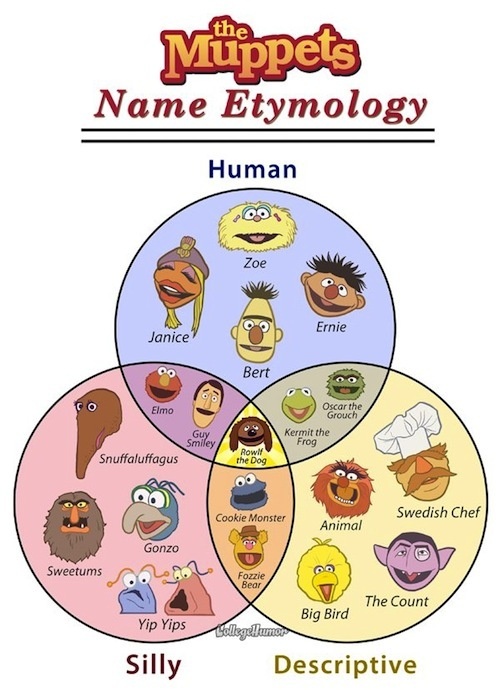
Designing data visualizations is a real art. Taking a set of data, be in numerical or not, and turning it into something which people can look at and immediately understand or get a grasp of is no easy task. This Venn Diagram of The Muppets is simple, obvious and provide values value to the user.
Recently, I was re-acquainted with a project called code_swarm out of UC Davis. This project aims at looking through the history of a software project and visualizing its development by looking at checkins in version control. I was curious what our source code history would look like, so I did a little bit of whiz bang stuff and produced this video:
[youtube=http://www.youtube.com/watch?v=GyohVDENrC8]
What it shows is the activity in our version control system for RoastLog. Whenever there is a code change pushed to our repository (yay Git!), a small circle is attached to the person’s name who made that change. It’s easy to see that I was working solo until about July of 2009 when Ryan started contributing. It’s also easy to see the huge push we made in the first part of 2010 before the SCAA show in April.
While this is fairly nerdy and not directly applicable for coffee people, it demonstrates that challenges that we face as engineers. Collecting data can be fairly straightforward. What we actually do with that data after it’s collected is be a much harder problem. This is completely on us. Our job is to deliver your data to you in a way which automatically makes sense and provides insight into what is going on with your business.
We’ve been doing a lot of work recently spec’ing out the new inventory system. We’ve learned that there are many parameters which roasters simply cannot answer. What was the final cost of a particular lot of coffee after taking into account storage fees for 3 months plus delivery fees? Each lot of coffee can be different, and there is simply no way to easily track all of this data right now. Our goal is to not only track this data, but provide a visualization so users can quickly gain insight into these metrics. Even if there is a magic spreadsheet somewhere which is all-knowing and can answer these tough questions, I’d be willing to bet that it falls short with respect to data visualizations.
We are not perfect either, but it’s in the forefront of our minds and were committed to building the best possible user interface and user interaction so that it’s easy, and enjoyable, to get at your data.
