User interface design is a tricky beast. It’s part art and part science…not programming. The fact that the majority UIs suck, to me, speaks to how hard it is to design a good UI.
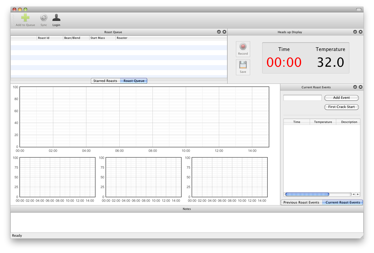
With our 4-input Data Bridge, there are some tough UI issues which we need to tackle. What’s the “best” way to display 1-4 roasting curves in RoastLogger? In the first iteration, I came up something which I thought made sense: create one main plot which can be though of as the “most important” along with three sub-plots.
The feedback Ryan received from folks was that they wanted to have all of these plots on one chart. Originally, I thought this was totally insane. With up to four curves for the current roast, and up to four for a previous roast drawn in the background, we now have up to eight curves drawn on one chart. Insanity! Indeed, making sense of eight curves on one plot is hard to impossible. Ryan came up with an initial layout which had some controls over which charts to show or hide. But now, just because a curve is toggled off for a given thermocouple doesn’t mean people aren’t interested in the temperature. Hrm, what to do?
Since we’re reworking the UI with the charts, it’s a good time to look at other aspects of the UI beyond the chart. When adding the three subplots, we took away some vertical resolution which meant that it’s a bit hard to see subtle changes in temperature. Realizing we needed to give back some vertical resolution, it was pretty obvious that the notes panel at the very bottom of the window was taking up more that it’s fair share as well.
So, our goals are:
- maximize vertical resolution
- allow fine controls over charts
- provide clear readings for time and all four temperatures
With all of this and some prototyping, we settled on the following changes:
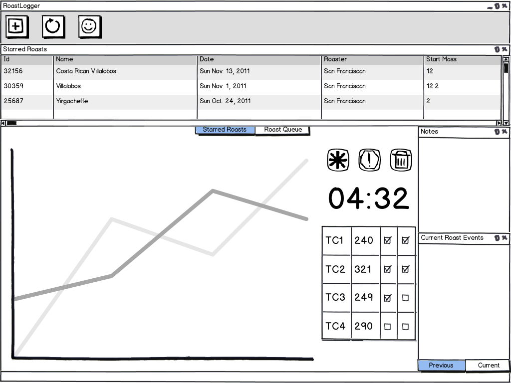
- all curves are drawn on one plot
- provide off/on toggles for curve 2, 3 and 4
- provide off/on toggles for all curves in previous roast profiles
- move all Heads-up Display elements into the chart (time, temp and buttons)
- move notes into a vertical panel
This really opens up the vertical space proving more room for the chart to draw curves. Inside the chart, the four TC temperatures will be displayed in real-time while roasting (that little table-looking thing). Checkboxes next to those thermocouple readings toggle the lines for the current or previous roasting profiles. For users who don’t need all four TCs, the inputs which do not find a TC plugged in to the Data Bridge will be automatically hidden. The Notes panel which doesn’t need a ton of real estate get’s kicked over to the right and is oriented vertically along with the events panel. However, the Notes panel can now be hidden so if it’s not needed, simply close it and keep it out of sight. The Roast Queue and Starred Roasts profiles panel remains the same, except that it can now be much wider since the HUD has been moved.
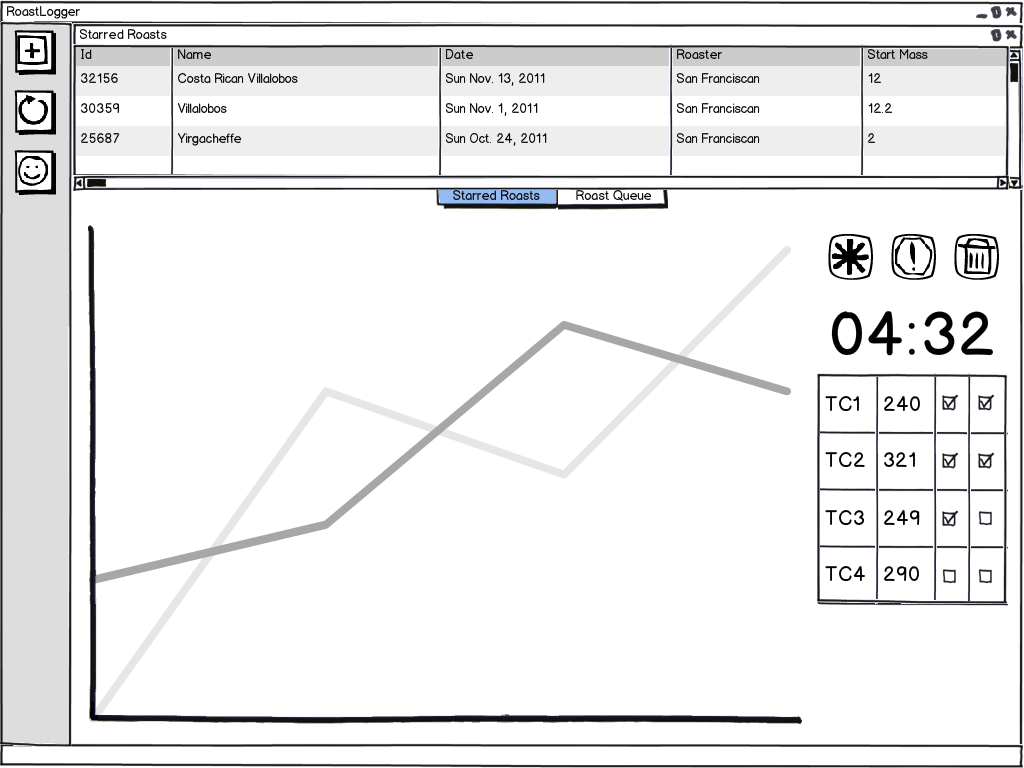
For those who really want to maximize the chart, it’s fairly simple. Each of these panels is moveable and close-able. Below is a wireframe of what it would look like when orienting the toolbar vertically and completely closing the Notes and Events panels.
These changes just need a bit more coding and testing, after which we’ll be releasing RoastLogger 2.1.2. I think this is a much better design and hope that it’s easier to work with.


1 Comment
Frying a turkey with software « RoastLog Blog · November 28, 2011 at 1:22 pm
[…] above, the burner TC was reading about 850F. One of the neat features of the updated UI is the ability to selectively turn on/off certain TCs on the plot. It was nice to see the burner temperature, but I didn’t always want it on the plot for […]
Comments are closed.